Bellroy Design System
Overview
Pitched, created and helped build Bellroy's first scalable design system from the ground up, now powering the entire site and being used across multiple teams.
Role
Design System Lead
Year
2023 – Present
Company
Bellroy
Team
Senior Front-End Developer, Content Co-Ordinator
Campaign output growth
Components in the system
Concepts presented per campaign
Languages supported
The problem
When I joined, Bellroy had no documented design system and few reusable components. Most UI elements were recreated or copied across files, resulting in a bloated, inconsistent workflow. Photoshop was still being used to build out pages and even there, there was not even a shared library in use. The site was being primed for massive growth, and with no system to support it, it raised huge future issues for a growing team and business.

A small excerpt of the audit, this page shows multiple styles of buttons on the site

The prioritisation plan which allowed me and my Senior FED (based in Germany) to collaborate
Making the case
I pitched the system to leadership as a business enabler, not just a design initiative, demonstrating how it would save time on repetitive design and development work, let us scale site updates more efficiently, unlock capacity across teams for larger and more frequent releases, and achieve brand cohesion across email, digital, social, and global marketplace teams. Previously, something as simple as changing our primary button's colour meant updating it instance by instance. The system I was proposing would let us update any element (and every instance of it in production) with the flick of a switch, while being intentional about what that change meant so it didn't break other instances or rules we'd already established elsewhere.
Scoping and prioritising the system
Retrofitting a design system onto a decade-old live site was challenging. I conducted a full audit to identify inconsistencies, duplication, and areas of inefficiency, a critical step to ensure the system reflected design, tech and marketing needs. I scored each component on frequency, reusability, and complexity, producing a prioritised roadmap. This let our Senior Front End Developer, based in Germany, and myself collaborate across time zones. We had a shared view of the most frequently used elements, what those elements were exactly and when we needed to build them.
Building the foundations
When I first joined Bellroy in 2017, I immediately moved them away from Adobe Creative Suite into Sketch, and then a few years later across to Figma. Once this project was accepted I knew Figma was the only tool for the job. I had previously spent time with other designers, developers and content co-ordinators providing support and workshops to help them get the most out of the tool (most had never used Figma before). Setting up those foundations were really important to give the team confidence in use and also assisted creating a collaborative environment where we could all help create correct processes and steps for projects and tasks.
To create the foundations for the system in Figma, I created a dynamic colour system using variables, started to build components and categorised library pages (banners, buttons, cards, etc). Once variables were established, I worked with the development and content teams to implement a 5-part semantic pattern system for colour variables which was a huge step forward in implementing this system on the development side. We also implemented Storybook, which included a "playground" where team members could explore and test components before use. This helped overcome some of Figma's own behavioural limitations and helped both content co-ordinators and designers speed-check things like appearance, accessibility or copy limits.
The responsive typography system followed similar principles. Instead of designers picking raw scale values directly, choosing a style now means choosing its role. The system accounts for line height, font family, weight, letter spacing and font size, all mapped to tokens and primitives. The system, originally created for English, also supports all 5 latin-based languages the site is translated into and was used as a basis for non-latin based languages we also support. Scripts like Chinese, Japanese, and Korean rely on entirely different character sets, so those type systems needed their own font pairings for each character type, and their own sets of values for each typography element. For this I worked with our Asian design teams to ensure our typography standards were correctly replicated across those languages too.
Building out components
Using our priority list, I worked extremely closely with our Senior FED to build out our first ever components. During this time, I established new processes and checklists which formed the foundations we still use to this day. This stage also required input from other designers and content co-ordinators to ensure that the capabilities and controls we were giving to components also made sense for their day-to-day work. These teams were instrumental in stress-testing the abstract concepts we had come up with and also challenging myself and our FED to make the system as robust as possible. The challenges presented in some of these conversations were vital in creating the system.
Working closely again with tech, our Senior FED was responsible for sequencing the final rollout piece by piece and bringing the system to life across our CMS.
Workflow and governance
To streamline future work, I introduced 3 lightweight Asana workflows to standardise component requests, edits, and new variation builds, each ensuring clear documentation of behaviours, overrides, and versioning from day one. I also set up a dedicated project within the program to monitor future work, updates, and non-urgent priorities once the first version had shipped. This forms the basis for our on-going maintenance to this stream of work.
Accessibility
Accessibility had been an organisational goal but was difficult to implement across the entire site. Partnering with our Senior Front End Developer, I embedded it directly into the system by enforcing WCAG 2.1 AA standards on all components, including colour contrast and type sizing, with non-compliant components automatically rejected rather than relying on manual review. This helps speed up work and ensures that colour contrast especially is always front of mind for our designers.
Adoption & Governance
To support cross-team adoption, I created documentation in both Figma and our internal Wiki, with additional engineering notes contributed by our FED in Storybook, and presented the system in a company-wide showcase to help teams across the business understand its benefits and how to work with it.
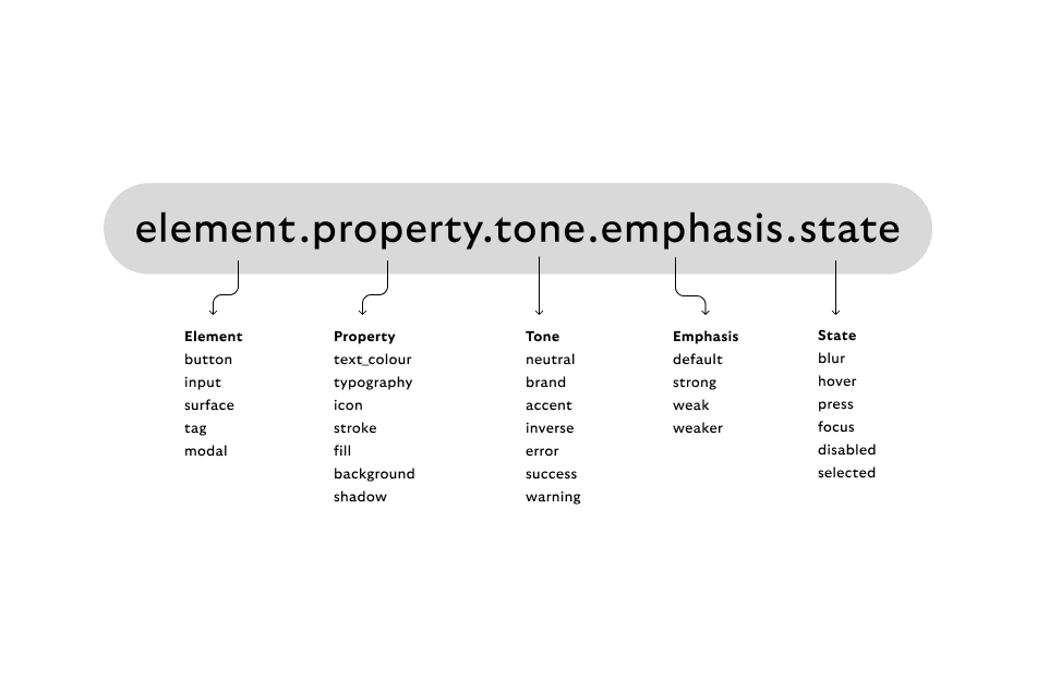
Our five-part pattern system for colour tokens.

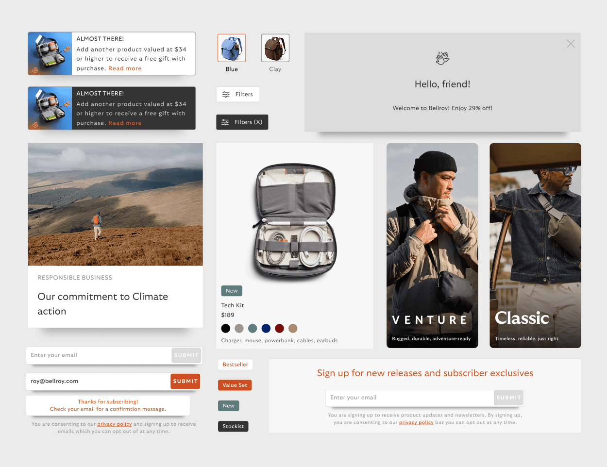
An example of how this works in situ.
An example of the three-tiered layer structure given to all components
A detailed look at how that translates to Figma variables.
Results & Impact
After launching the first phases of the system, component reuse increased significantly, reducing inconsistencies, design time, and build time. Initial design time per concept went up, the team could average 3 concepts per campaign instead of 1, each of a higher quality even at the early planning stage. Removing that blockage lifted campaign output by 45% year-on-year. Documentation empowered new designers and developers, meaningfully reducing onboarding time, and the system proved flexible enough to support broader brand updates, including new font styles system and colour changes made for accessibility. Not to mention copious amounts of code lines removed and replaced with a much more robust and simplified system. Beyond its technical performance, it's given power and clarity to teams and individuals, empowering team-members to apply rules, structures and intentional decisions to brand elements ensuring their scalability for the future.
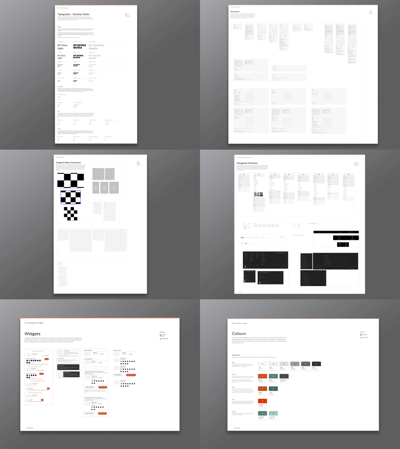
The system is now actively and frequently used by multiple developers and designers, with 60+ robust components powering the majority of Bellroy's live pages.
What's next
This system laid the foundation for scalable, accessible digital work at Bellroy, but more importantly, it reshaped how our teams think about consistency and collaboration. I continue to evolve the system alongside day-to-day priorities.
The library was never meant to be a one-off deliverable. As the business has grown and changed, so has the need for a shared way of working across more teams. I'm currently leading a new initiative alongside our Director of Operations to further strengthen ownership and process. At the moment, we are looking at migrating our componentry across to Astro, to enable more flexibility and integration with our current systems.
Running this library, and now this next phase of it, is one of the more significant responsibilities I hold day to day. It's the foundation everything else the site builds on, and it's a big part of how a small team is able to ship as much work as we do. It is a growing, organic body of work that I lead in partnership with the designers and developers who build on top of it.