Bundles Widget
Overview
Redesigned how bundle offers surface on Bellroy's product pages, delivering a 4.79pp lift in conversion across 150,000+ users tested.
Role
UI/UX Lead
Year
2020
Company
Bellroy
Team
Developers, Merchandising, Copywriting, Content Coordinators

Overall conversion rate improvement
Additional revenue generated
Users A/B tested across desktop, mobile, and tablet
Tablet conversion lift (strongest performing device)
The problem
Bellroy's bundles offering had historically struggled with uptake. Despite smaller initiatives to increase visibility across the site, engagement remained below expectations. Previous tests had shown that surfacing offers earlier, especially on product pages, drove conversion when the offer felt directly relevant, a gift with purchase or an exclusive discount, for example. We applied this learning to a product-page-based insight: highlighting bundle opportunities at the exact moment a customer was considering a purchase.
The main challenge was presenting a large amount of contextual information in a small space without disrupting the core PDP experience. Key considerations included clearly displaying the value of the offer, showing bundle product names and images for clarity at checkout, supporting variant selection (colour and sometimes size), allowing customers to add both items to cart directly from the PDP, and providing an option to visit the full bundle page for more detail. All of this had to work within a non-intrusive widget that integrated with Bellroy's existing promo engine, which only applied discounts once both items were actually in the cart, a real technical constraint shaping what the widget could and couldn't do.
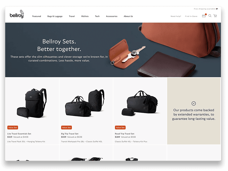
Previously, a customer had to know to visit the bundles range page to make use of the deal

Products are shown together with the customer then being able to select SKU type and add both to cart where the automatic discount is applied
My role & key decisions
I made the call to bring the bundle offer directly onto the product page rather than leaving it siloed in a separate bundles section, designing toward a widget that could sit within the existing PDP experience without disrupting it.
How I approached it
After reviewing customer behaviour data, I held a 15-minute brainstorm session to explore what might be causing low bundle uptake. A recurring theme emerged: visibility. Many customers simply weren't aware of available bundle discounts early enough in their journey to influence purchase decisions. To guide the design, we established a problem statement: "As a customer, I want to know about discounts available to me as early as relevant in my purchase journey, so I can consider them while browsing." We hypothesised that using a familiar promotional widget format, one previously proven effective, would improve awareness and conversion.
From there, I presented three wireframe concepts, each exploring a different flow. One simpler option alerted customers to a bundle discount but required them to visit a separate bundle page to redeem it. Testing showed this created unnecessary friction, the extra steps confused users and reduced engagement, and few customers followed through to claim the offer. That insight let us confidently rule the approach out early and focus on more seamless alternatives.
The underlying bundle combinations were based on the most frequently purchased product pairs, but my idea was to go further and surface a discount only when we already had a clear signal of intent, showing an offer for a Toiletry Kit alongside a popular paired item, for example, when a customer was already browsing one of them. With help from our Web Content Coordinator, I used dimension value tags, a product setup I'd helped build on a prior project, to tell the CMS when and where to trigger the widget, ensuring each paired product surfaced the bundle offer on its own respective PDP.


Some early design concepts
The final flow
Results & Impact
While designing the widget, I recognised that requiring both colour and size selections could introduce friction and reduce conversions. Rather than assume the more complete option would win, I planned a three-variant A/B/C test, control, colour-only, and colour-plus-size, to isolate that variable and de-risk the rollout before committing engineering resources to a single direction.
The solution itself was a compact, accordion-style widget. Collapsed, it highlighted the value of the bundle offer; expanded, it let customers select colour (and size, where applicable), add both items directly to cart, or visit the bundle page for more detail, all while respecting the visual hierarchy and flow of the existing PDP.
Variant 1, colour selection only, performed best, delivering a 4.79 percentage point lift in overall conversion with 96% statistical confidence, tested across 150,000+ users on desktop, mobile, and tablet. The uplift was strongest on tablet (+8.07pp) and mobile (+7.3pp), with a smaller but still positive lift on desktop (+2.05pp), and the change generated $27,669 in additional revenue. Variant 2, which added size selection, underperformed across the board, reinforcing that the extra choice was adding friction rather than value.
This test reinforced a core UX principle worth carrying forward: simplifying user decisions at the point of purchase drives stronger outcomes. By reducing cognitive load and presenting clear, contextual value, the team created a more effective, scalable bundles experience that shaped how later product page tests were framed, favouring focused tests over complex ones when validating a hypothesis.