Homepage Redesign
Overview
Redesigned Bellroy's homepage for the first time in nearly a decade, driving a significant lift in product discovery across an 11-week, 2.5M-user A/B test.
Role
Product Design Lead
Year
2025–2026
Company
Bellroy
Team
Product/Tech Lead, Lead Developer, Art Direction, Copywriting, Data & Analytics, Translation, QA, cross-functional team of 12+

Direct-to-product CTR
PDP reach rate
Users A/B tested across both arms
Search CTR
The problem
Bellroy's homepage hadn't been meaningfully touched in over a decade, designed originally for desktop back when the range was 4–5 categories, then scaled down for mobile rather than rebuilt for it. By 2025, mobile made up 56% of homepage traffic yet converted 33% worse than desktop and bounced 39% more. New visitors, 73% of all homepage traffic, converted 95% worse than returning visitors. Only 30% of homepage landers ever reached a product page, and 23% of visitors looped back to the homepage mid-session, using it as a reset point when they got stuck elsewhere. The pathways that converted best, search (4.47% CR) and direct-to-product (3.35% CR), were the least visible on the page, while category browsing, which had a 51% drop-off rate, dominated the layout. Mobile performance compounded the problem: a Lighthouse score of 47/100 and an 8.3-second Largest Contentful Paint.

Old homepage design (full height)

Old homepage design (zoom)
My role & key decisions
As Product Design Lead, I led the initial data investigation myself, framing the questions for our Marketing Insights Analyst to build out in Looker, then personally analysed the resulting 90 days of behavioural data (4.8M sessions, ~749K homepage landers) to build the test hypothesis and problem statement that anchored the whole project. I owned the project end to end: RACI, scope, kickoffs, success metrics, testing schedule, and QA coordination across a 12-plus person cross-functional team.
From the data, I identified that the homepage was actually failing at two distinct jobs simultaneously, acting as a primary entry point for 79% of landers and as a recovery point for the 23% who looped back mid-session, and built the response around five principles: mobile-first design, immediate orientation for new visitors, elevating the pathways that already converted well, reducing navigation friction, and building the whole thing as a modular, scalable system rather than another one-off page. I also made the call on how success would be measured: PDP reach rate (product discovery) as the primary metric for the eventual A/B test, with conversion, AOV, and bounce treated as guardrails rather than the headline. I made the case early that this redesign needed to be judged as a discovery and orientation tool, not a conversion-optimisation play, the data showed customers couldn't find what they needed, not that they were unpersuaded once they did, so proving out discovery was the right bar for success, even if conversion itself didn't move.
How I approached it
I audited the existing homepage and traffic data, then moved into wireframing, presenting concepts to Creative and Tech leads separately to validate design intent and technical feasibility before committing to a direction. Design and copy went through two structured refinement rounds with our art director and copywriter, alongside parallel workstreams for translations and componentisation with our tech lead, so the final build would support future localisation and campaign flexibility rather than being another rigid page. Once handed to development, I ran structured QA across functionality, CMS usability, design and styling, copy, translations, and overall experience with the full team before sign-off, then defined the experimentation approach: success criteria, testing schedule, and analysis plan, ahead of a live 11-week A/B test.
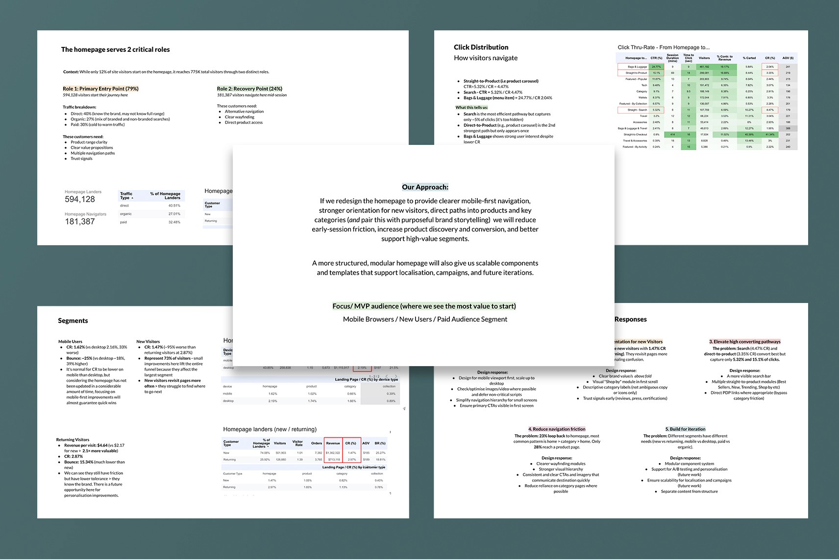
Some excerpts from my initial data analysis report, the findings which underpinned the entire project.

Annotated wireframes from the initial discovery - these were presented along with the data analysis
An early design concept – with huge cross-team collaboration
Snippet of a section of the final desktop design
Results & Impact
This wasn't a small tweak being tested, control and variant were two aesthetically and functionally distinct homepages: an entirely new visual language, layout, and navigation model tested directly against the decade-old original. That scale of change is exactly where you'd expect real risk, confused customers, broken habits, a conversion hit while people adjust. Against that backdrop, the results are a genuine success.
Across an 11-week test with roughly 2.5 million participants, an estimated 35,000 more visitors clicked straight through to a product on the variant than the old design would have produced at the same volume, a 28.7% lift in direct-to-product click-through. Roughly 10,000 additional visitors reached a product page who otherwise wouldn't have, moving PDP reach rate from 49.84% to 50.63%, the exact metric we'd set out to shift. Search click-through was up too.
Conversion and revenue held steady across that same dataset. For a change this dramatic, that's really positive. I will be honest here in that more clicks to more pages meant that customers explored further, but without the substantial lift in conversion my initial hypothesis "essentially, more customers to more pages means more purchases" was not right. After further analysis we now understand some frustrations downstream.
The homepage project was important, it led us to understand that using this page as a surface for discovery is good, and now we can address underlying issues in other parts of the customers journey through bellroy.com. And so, after 11 weeks, with the primary metric clearly achieved and zero cost to the bottom line despite the scale of the redesign, I made the call, together with the team, to conclude the test, ship the variant as the new permanent baseline, and move into the next phase of iteration.
What's next
Iteration is already underway on the homepage itself, with component optimisation selected as the next focus. But the bigger outcome of this project has been strategic. The discovery-phase research surfaced clear evidence of downstream customer frustration, particularly the 51% drop-off on category pages and the homepage looping behaviour tied to it, and as a direct result, Bellroy is now kicking off a similarly-scoped project for category pages, with discovery and product understanding again set as the primary goals. Beyond that, this work has become the starting point for revisiting the entire purchase funnel: setting new frameworks and re-examining our own core understanding of the purpose and goals behind each product, rather than continuing to treat each page in isolation.