Overview
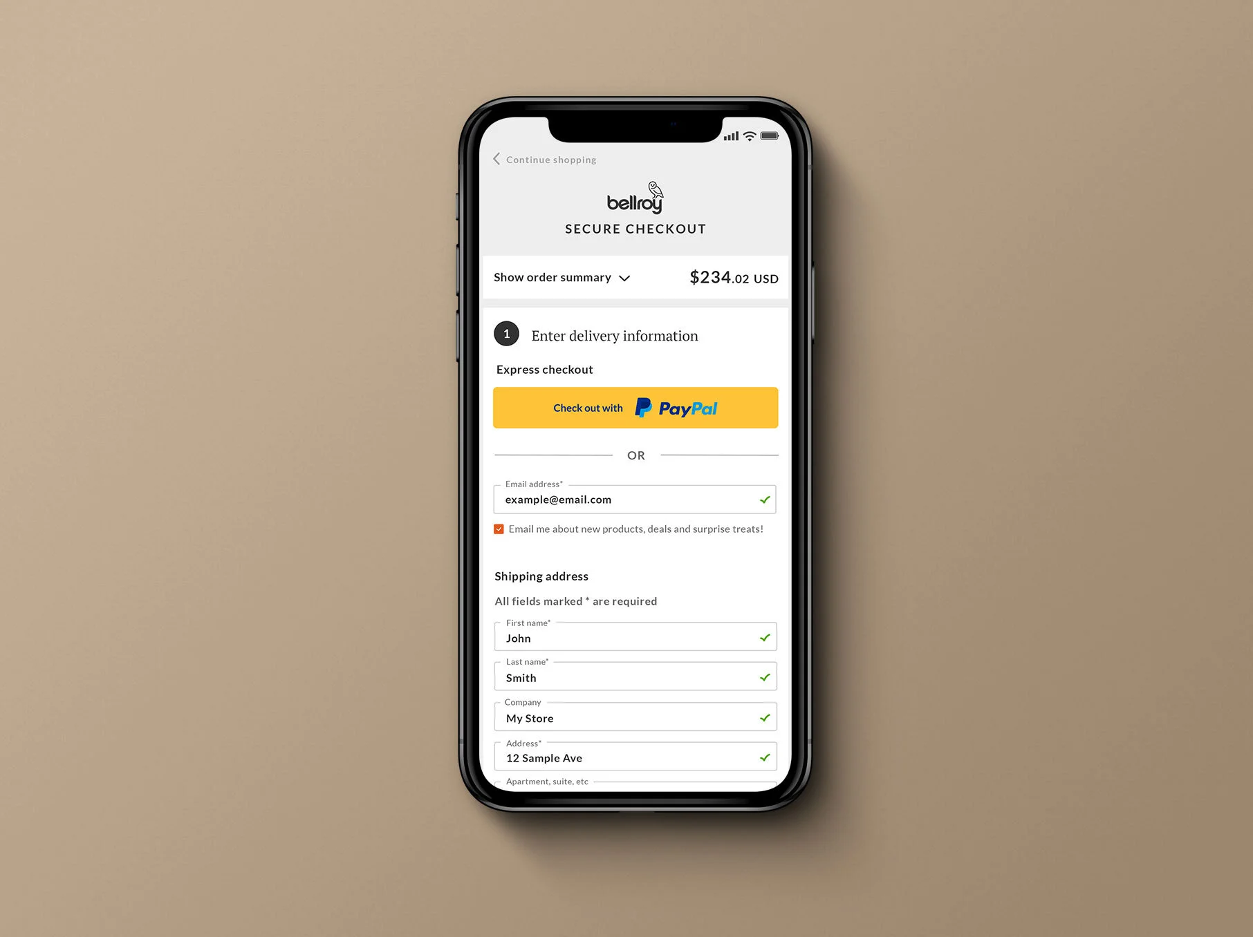
A concept redesign aimed at simplifying Bellroy's checkout flow and reducing friction, without disrupting its familiar one-page structure.
Role
UI/UX Design
Year
2020
Company
Bellroy
The problem
Bellroy's checkout is a critical moment where users decide to complete their purchase or leave. Improving this experience means reducing friction and abandonment without disrupting the familiar one-page flow or diluting the brand's trusted feel. This project focused on making checkout simpler and faster while maintaining a seamless, confident user journey.
My role & key decisions
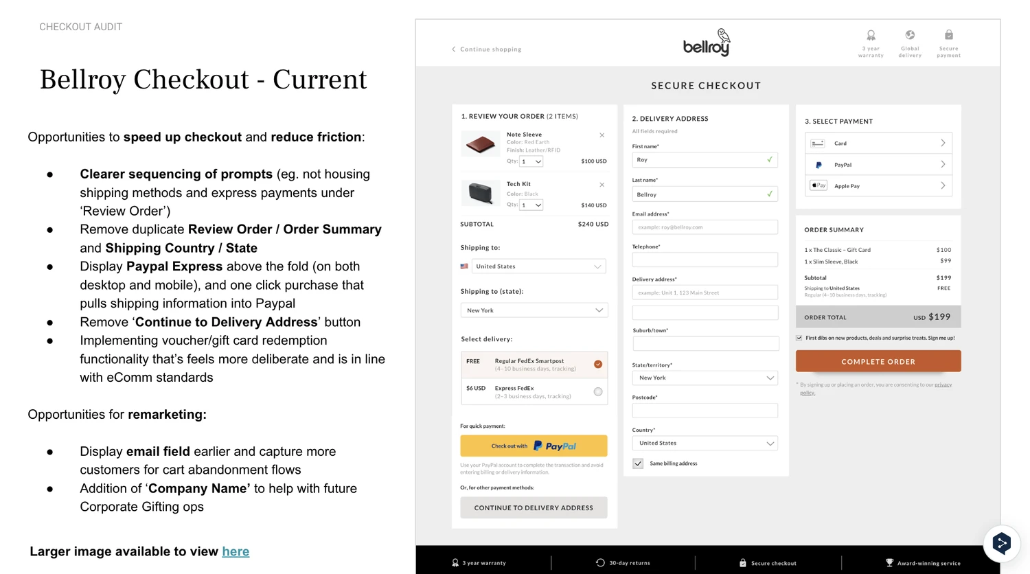
I led the redesign of Bellroy's checkout experience, working closely with data and cross-functional teams to identify key pain points through behavioural insights and funnel analysis. I set the aim as optimising the form structure, reducing unnecessary steps, and creating a more cohesive, efficient checkout flow, all while keeping it scalable and consistent with Bellroy's broader design system, rather than treating checkout as a one-off page disconnected from everything else on the site. I also made the call to ground the proposal in a structured competitor review rather than working from assumption alone, and to take the resulting recommendations directly to senior leadership as a considered set of changes rather than piecemeal suggestions.


How I approached it
I reviewed various retailer carts and checkouts, alongside our own, looking for trends and patterns that could inform how we improved the experience. I analysed the UX and UI of checkouts from brands including MAPP, Allbirds, ASOS, The Iconic, and Bunnings to identify genuine opportunities rather than just following convention for its own sake.

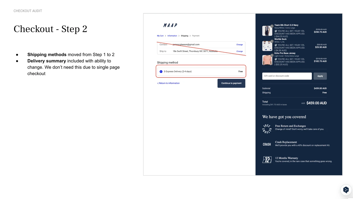
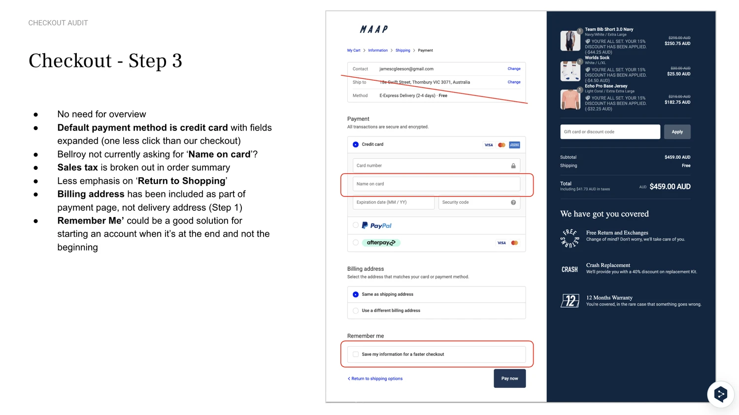
That research led to a specific set of planned improvements I put forward to senior leadership: reducing page height by roughly 40% to create a more focused experience, numbering and clearly defining each section (Delivery, Shipping Method, Payment, Order Summary), surfacing express checkout and email sign-up earlier in the flow, and condensing input fields with cleaner UI to reduce perceived effort. I also proposed expanding the credit card section within Payment, since credit card accounted for roughly 55% of .com transactions, adding a "Remember me" checkbox for faster repeat checkouts, aligning the Review Your Order section with the mini cart UI and highlighting free or discounted items, adding a gift card and discount code field, grouping key USPs above the fold for stronger value reinforcement, and replacing the full footer with a slim set of high-utility, frequently accessed links.

