Overview
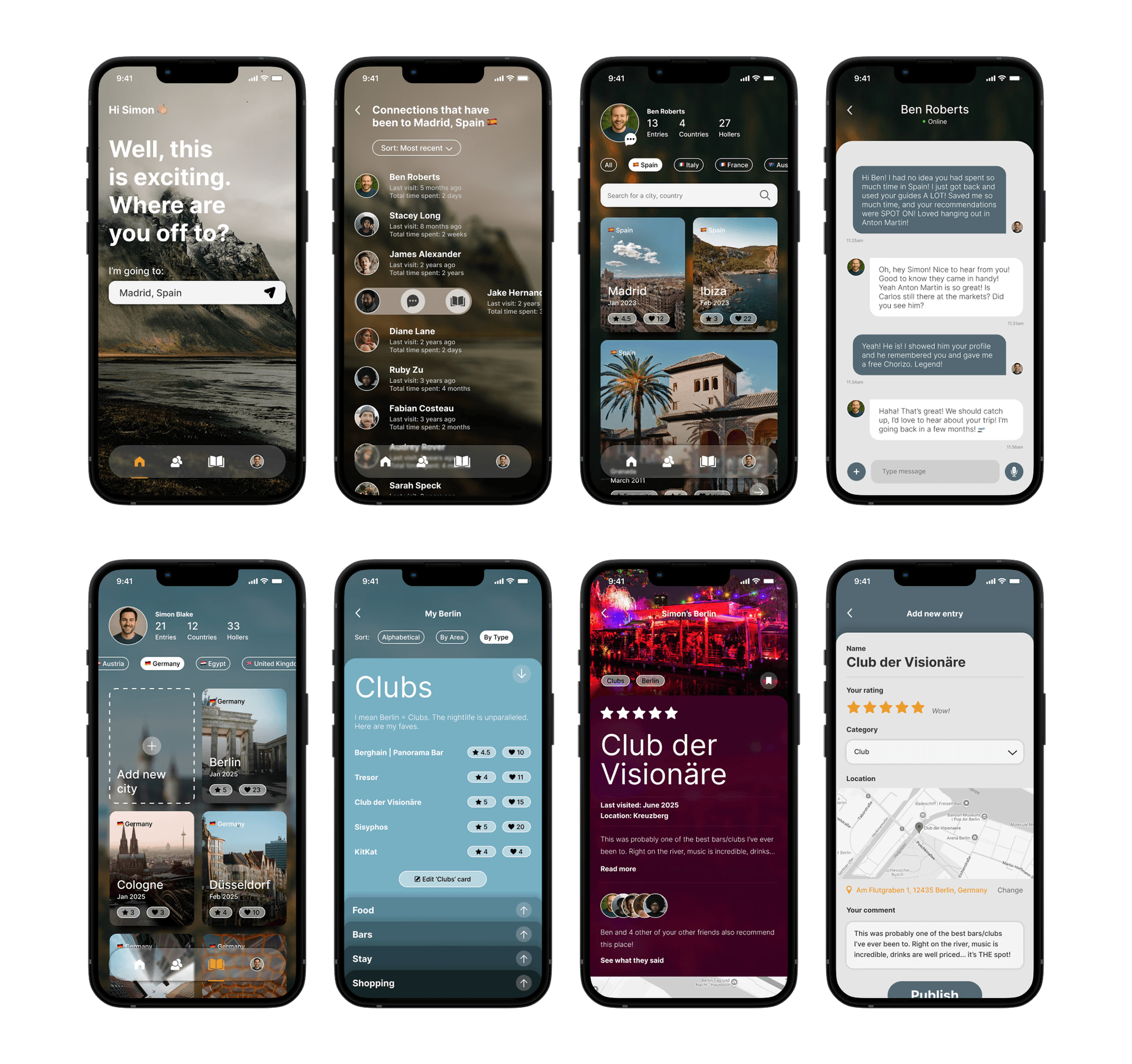
Through user research I explored the need for a travel app that users could easily trust. The answer? Holler. A tool connecting you with people you actually know to share travel experiences and recommendations you actually care about. Undertaken over 10 weeks for General Assembly, I dived head first into a complete UX study.
Role
UI/UX Design
Year
2018 & 2024
Company
General Assembly

The Problem
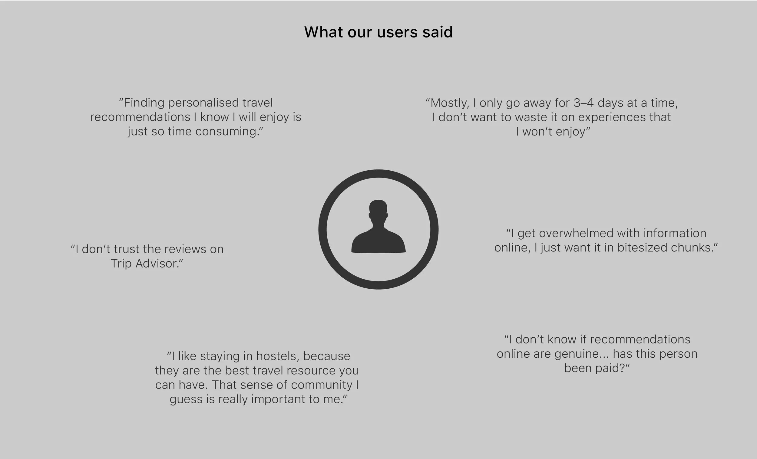
There are plenty of handy travel resources out there, so what is it that isn't satisfying our users? Time poor, young adults want quick, easy to access, correct-every-time information from people they know and trust. Their current journey to find travel tips online was tainted with past negative experiences and an overall feeling of uneasiness about the people they were actually receiving recommendations from. This, coupled with our users struggle to find enough time to devote to this process and the overwhelming amount of information available online signified a problem. Users not only needed a tool they could quickly and easily navigate but one they could really trust – no questions asked.
The Process
After conducting a series of user interviews we validated assumptions and synthesised the results. Due to time constraints, we decided to focus primarily on tasks which involved finding a users connections, finding content related to a travel destination and posting content. This led us to create a key user flow to assist with the next steps of the project.

So, who are our users and what do they want?
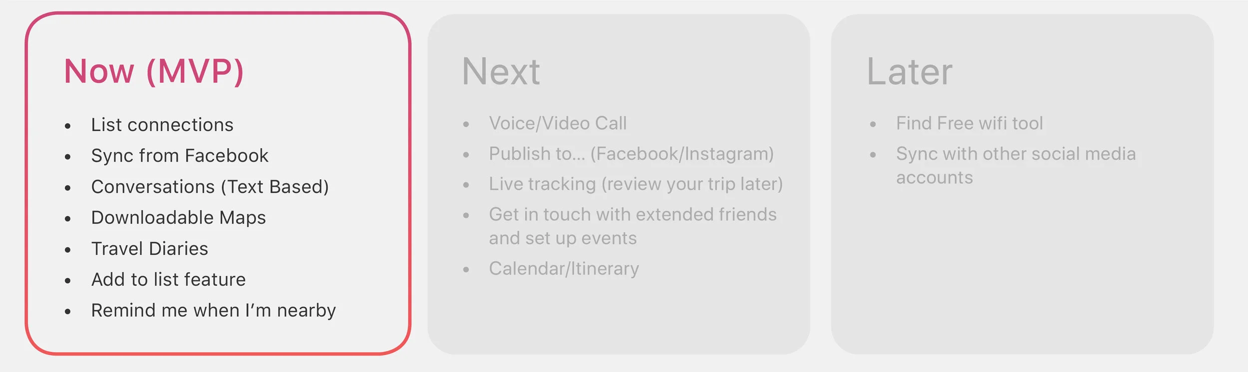
We conducted customer and market research to drive our planning phase. Armed with the information that we had already learnt during our user interviews, we set out to create a key persona, prioritise features based on user goals and conducted further research into the information architecture for our product.
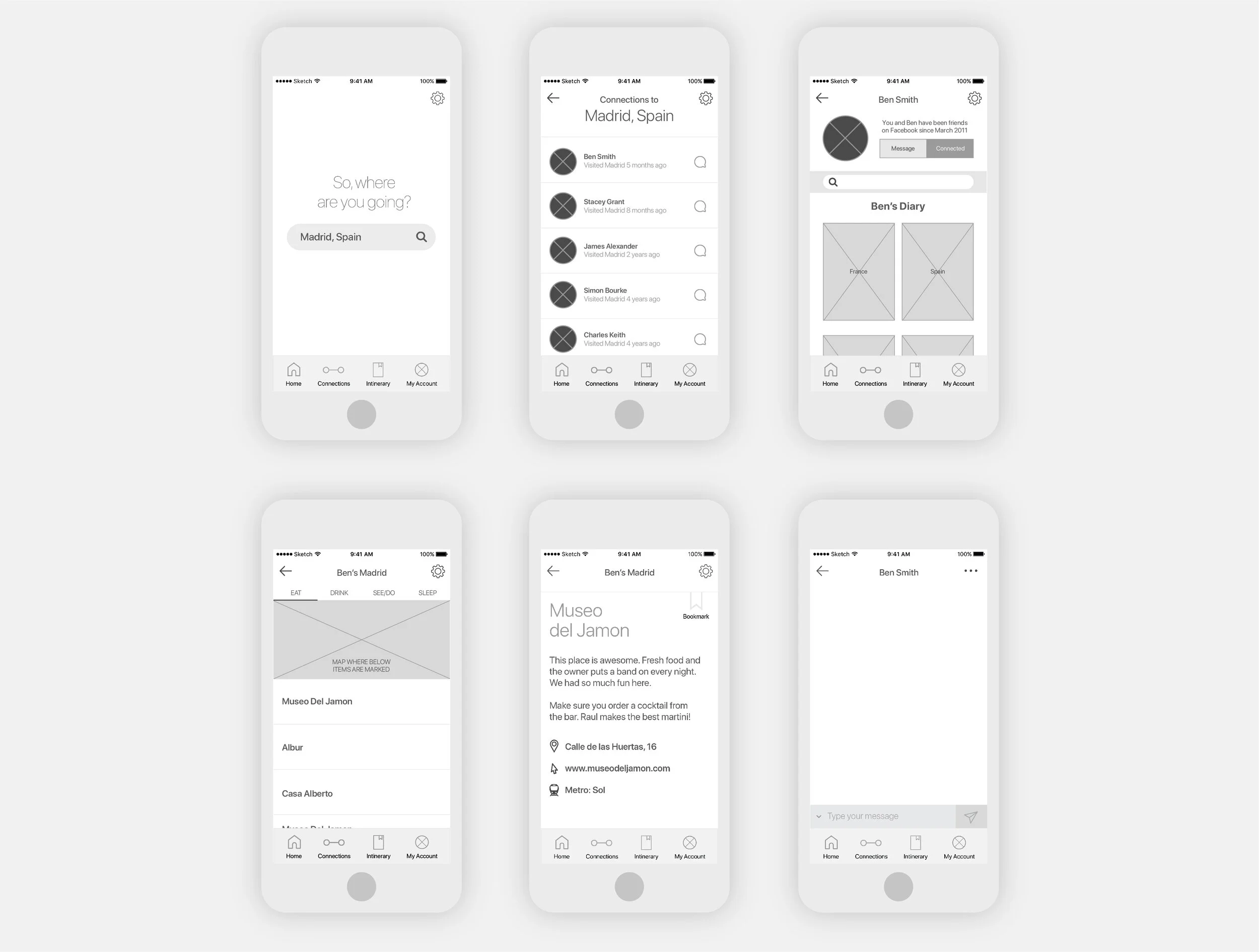
Solidifying our user expectations we began to create wireframes of the key screens for the app.
Testing
Over a few days a prototype was created using our wireframes. We got to work creating 3 task scenarios to paint the picture for our users and arranged 15–20 minute
sessions to get into the nitty gritty of testing the very first prototype.Feedback from our users was incredibly valuable and resulted in some key changes to the UX and also the UI.
The Result
The finished prototype is a personalised guidebook filled with trusted information from people you actually know. Within the app, users can write their own reviews on places they've visited, search for recommendations through their friends' diaries and strike up conversations through the (text-based) messaging service within the app. Along with a clutter-free UI and simple navigation users are provided with a quick and easy way to access the top line information they need to plan their next trip.

Key Takeaways
Further testing of the prototype would be ideal as well as an in depth phase on value and how we can keep our users returning. Implementing some additional features would also be worthwhile after a final testing phase has been completed.
(This project was completed as part of my UX Design Course at General Assembly and as such what you see above is a stripped back version of the final study.)
Self-initiated Update
In 2024, I revisited this project as a way to challenge myself and explore how far I’d come as a designer. The original project wasn’t design-led, but I’ve always been fond of the concept. With fresh eyes (and a rainy afternoon to spare), I gave it a visual refresh, bringing more polish, structure, and maturity to the UI while staying true to the spirit of the original concept.