Overview
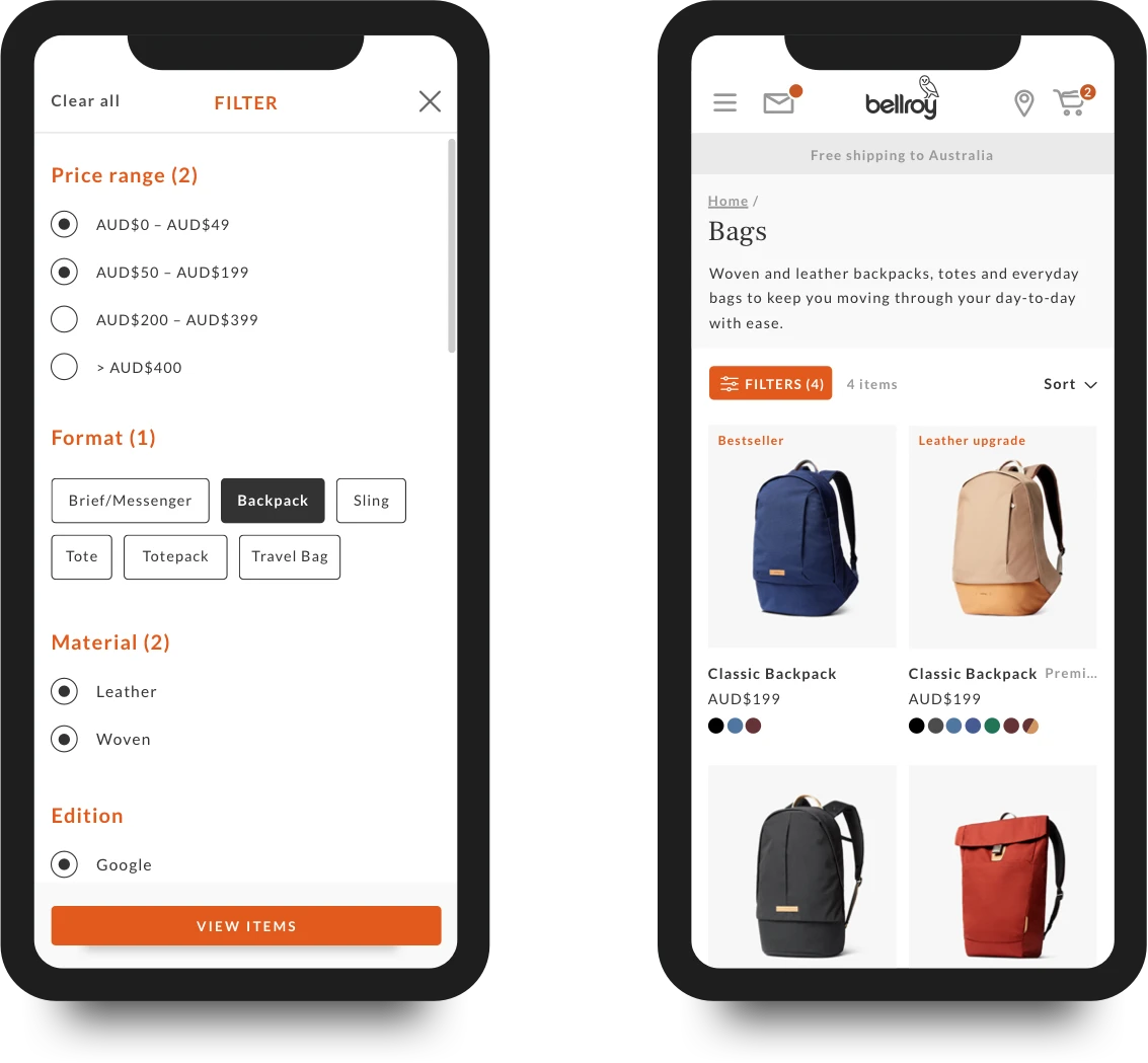
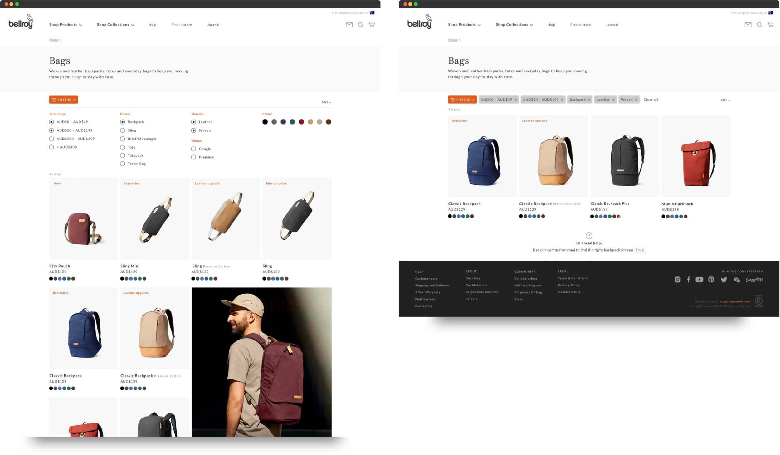
A concept redesign exploring how filtering and navigation could scale with Bellroy's growing product range.
Role
UI/UX Design
Year
2019
Company
Bellroy
The problem
This project set out to improve how customers navigate Bellroy's growing product range. Since I joined in 2017, the business had expanded well beyond wallets to include backpacks, slings, totes, travel bags, and a much broader tech offering. With that growth came increasing complexity, especially when the differences between products were subtle, or their intended uses overlapped. Some products were designed with clear use-cases, but many were versatile, making it harder for customers to compare and choose with confidence. We needed a way to surface the right information at the right time, reduce friction in the decision-making process, and help users feel confident they'd found the product that truly fit their needs.

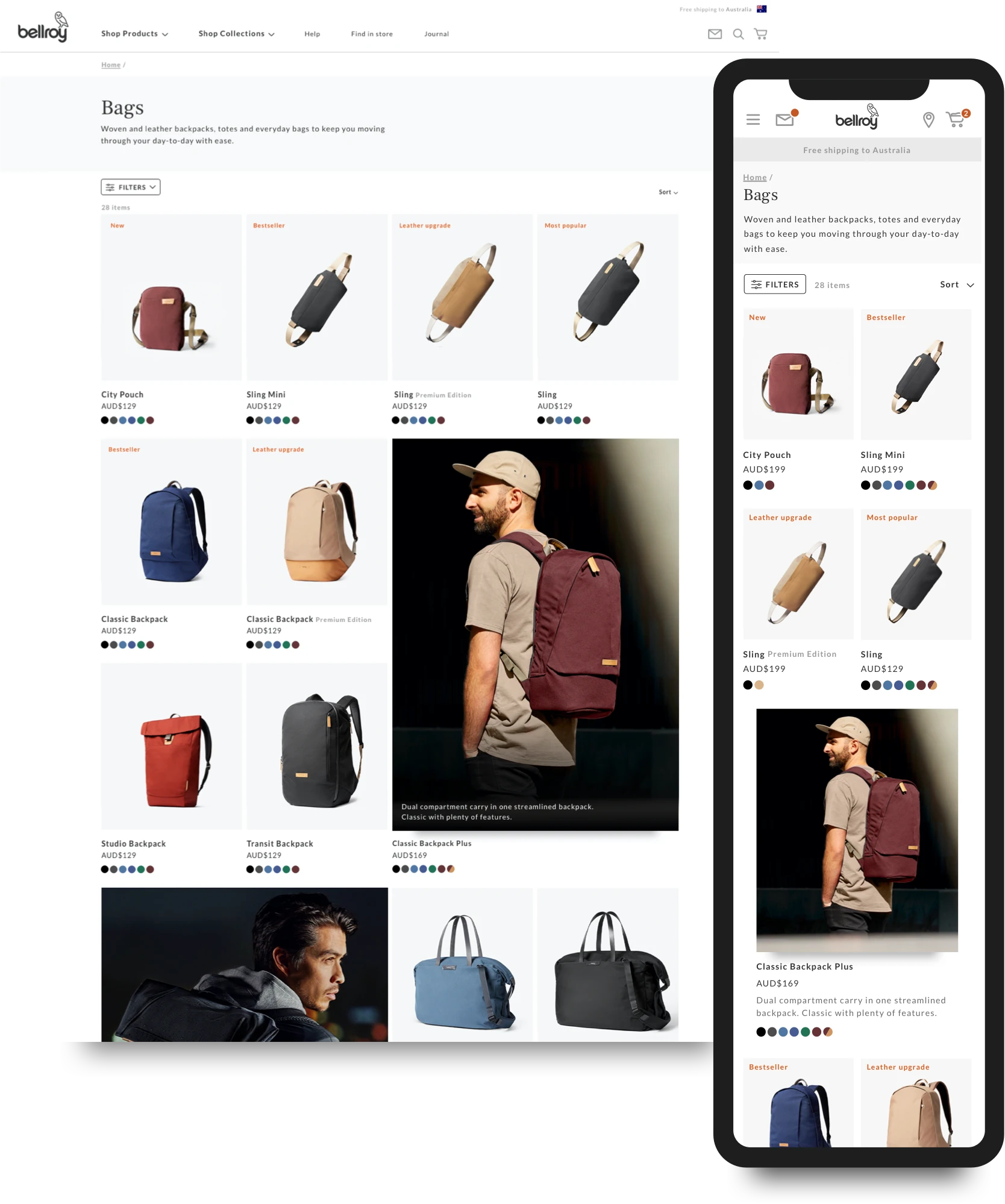
Original range pages 1.0 - no filter or sort functionality existed and product tiles were responsive to screen size which changed their appearance device to device.
My role & key decisions
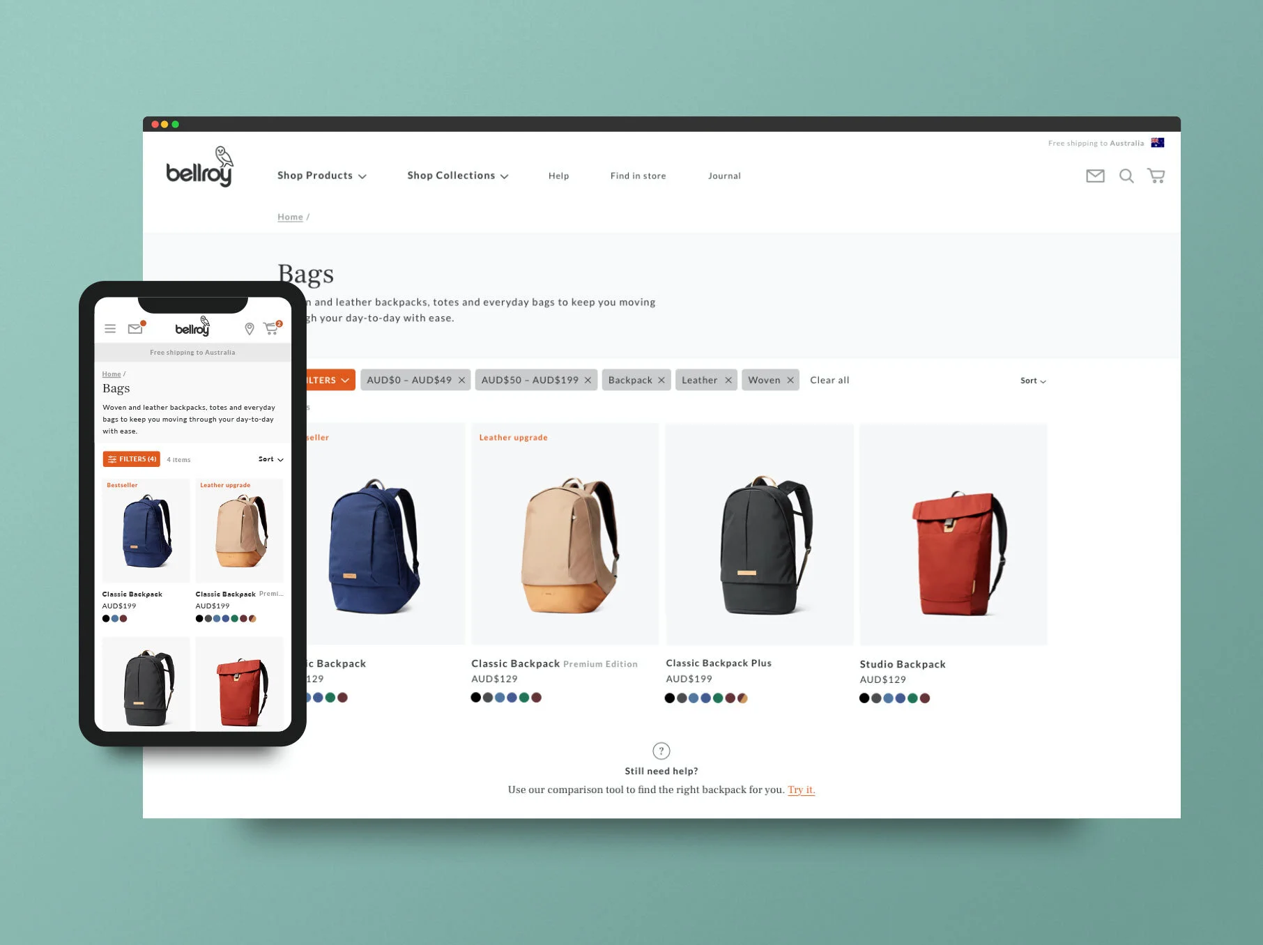
I worked as Lead UI/UX Designer on the category page redesign, with a particular focus on designing a filter and sort function the site didn't yet have. Bellroy had no existing filter system to build on or iterate from, so after confirming filtering was something customers would genuinely find helpful, I made the call to scope this as a first iteration, with more refinement expected to follow rather than trying to solve every edge case up front. I worked not just as the designer but as a key member of the broader UX team in deciding what product dimensions should be considered for filtering in each category. Alongside the filter work, I identified an additional opportunity worth pursuing: a more in-depth comparison page for the bags range, to help customers with the most versatile, hardest-to-compare products in the catalogue.
The updated category page design enabled a more versatile design and enabled the internal teams to promote certain products to meet sales or stock goals. The mobile experience specifically is a much easier interface to navigate.
How I approached it
I researched and presented a full audit of the existing category pages, along with conversion recommendations and design solutions across the page's many sections. I proposed mockups for new features, including more detailed delivery and shipping information sections and a more considered, helpful gallery widget, and worked with the Tech and Digital teams to put together a testing schedule and rollout plan for how this could be delivered in stages.
Beyond the filter system itself, the proposal included a broader set of updates: new "spotlight" sections to promote selected products and show more varied imagery at a category level, a reworked page grid for better visual stability, new content sections on range pages for SEO, reinstated breadcrumbs on mobile, and reworked USPs on product tiles to give customers more context at a glance. We also looked at SEO considerations for each page as part of the same body of work.